The graph below is created to compare the screen time usage of the data given by all the data visualisation students.
The graph below is created to compare the screen time usage of the data given by all the data visualisation students.
Data journalism is when they use key information sets, key data key references elements to convey a story.
“It’s not the existences data not just obtaining it it’s the processing that foes into it to work out what it tells you. You have to ask the right questions to get the right answers”
“Recognition and power of measurement in helping conversations”
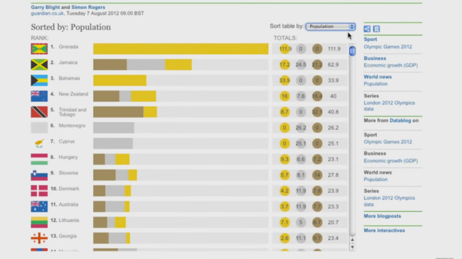
Data journalism in action: the London Olympics (The Guardian, 2013)
This data visualisation was design by Garry Blight where the interactive piece showed how the more developed countries grabbed a lot more attention. The designer of this interactive data used google spreadsheets to constantly update the graph in order compare all the different countries.
References:
History of Data Journalism at The Guardian. (2013). Retrieved from https://www.youtube.com/watch?v=iIa5EoxyvZI
The Guardian,. (2013). Data journalism in action: the London Olympics. Retrieved from https://www.youtube.com/watch?v=WyjBJzigm0w
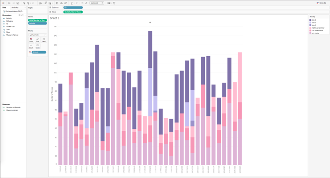
This graphs were created in Tableu.
This was a group exercise where myself and Nathan created these two graphs using tableu. The one above was created by me while the one on the bottom was created by Nathan.
Looking at these two graphs I believe that it can represent and tell the data clearly.

This video talks about the reason why and how we use graphs to compare things easier.
Readability – Readers would usually find bar graphs easier and would have more accurate comparison because of its simpleness and could easily compare the height while on the bubble graph users can easily misjudge the size difference of the data. Therefore between the two, bar charts wins readability
Aesthetics – Aesthetics is also important when making data visualisation, it is important because this is one of things that will keep a reader interested. Bar graph is easy to read and is also appealing but bubble graph on the other hand is more aesthetically pleasing thats why designers tend to misuse this type of graph.
The video also talked about the three common types of graphs designers use in order to visualise a data:-
One thing that got my attention is that designers often tend to choose the wrong type of graph to show the data. Designers are not familiar on how and when the graph needs to be used in order to be effective. Designers need to learn how to make aesthetics and information balanced in order to create a stunning and amazing data visualisation
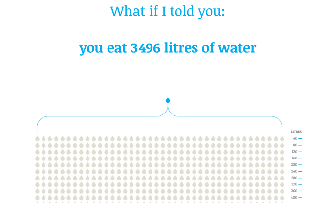
What story does it tell? – The visualisation informs the audience on the levels of water they unknowingly consume on a daily basis. Most water is consumed indirectly through every day products both within our diets and lifestyle. These products include such as meat, vegetables and chores completed around the household such as showering and using the dishwasher.
How does it tell it? – This information is presented in the form of a webpage, utilizing the scrolling function of the computer mouse. By scrolling down the page the user gradually reveals information via graphs and statistics.
Does it allow for different levels of interrogation that can be seen or used on the part of the reader? Eg. Can they drill down to discover more detail? – The visualisation is presented in quite a linear progression, meaning that it is difficult for the reader to interrogate different levels of information. With this in mind, throughout the interactive there is still room for different levels of interpretation within certain elements of the visualisation.
Are you able to create multiple stories from it? If so, what are they? – Being such a linear presentation of information it is again difficult for for reader to create any other story other than what the designer has portrayed, the story of how much water we use.
What can you say about the visual design- layout, colour, typography, visualisation style? – I believe that the overall visual design of this piece is interesting and successful. One of the reasons why this piece is interesting is the way the designer layed the document out where bits of information are being revealed when ever we scroll through the document. The animation happening on the background grabs the attention of the users in which case would want to keep scrolling to learn more information about our daily consumption.
The colour used suites the theme of the data visualisation piece as we often represent water with the colour blue. The colour grey and white are also used in the colour palette because of its neutral tone that will not grab the attention from the important information the designer is trying to show which are usually in blue.
The icons and image treatment used is pleasing to the eye and is also used to tell a story that everyone can understand. The thing I liked with this is the minimal amount of text written on the screen as we as a generation today who is pressed with time would rather see things visually than to read chunks of texts in order to find something we want to know.
The animation works really well as it keeps the users interested by seeing movement rather than just a flat design that does not move or animate.
What improvements would you suggest? – The linear style of the design makes it hard for the users to go back into sections so I would suggest having a section bar on the side of the data visualisation.
The users cannot compare data but is forced to see in the author/designers perspective. A feature that allows the users to play with the information for them to see and compare data can also be helpful as users can see how they can help save and conserve water.
The never-ending animation such the one found in the part where it says EVERYDAY. Eating water….. can be somewhat distracting as it draws your eyes to watch the animation instead of you drawing to the important information written under it.
reference: http://www.angelamorelli.com/water/
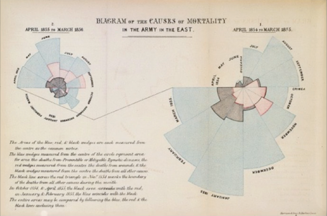
With the increasing demand of data being accessible in a daily basis it is important that large amounts of data can be visualised in a way that almost everyone can understand. I believe that data visualisers have an important role in design as they can help people understand data in a much simpler way. Learning the history of data visualisation is important as we get to understand and see the different trends and techniques that have already been used. Learning the history will also help us find out what techniques was most effective in the time. An example of this was the data visualisation Florence Nightingale created of Napoleon’s invasion where her graph helped them realise that most of the soldiers were dying not because of the battle but due to sickness.
As a visualisation designer it is important to know what the data is and what you can do with them.
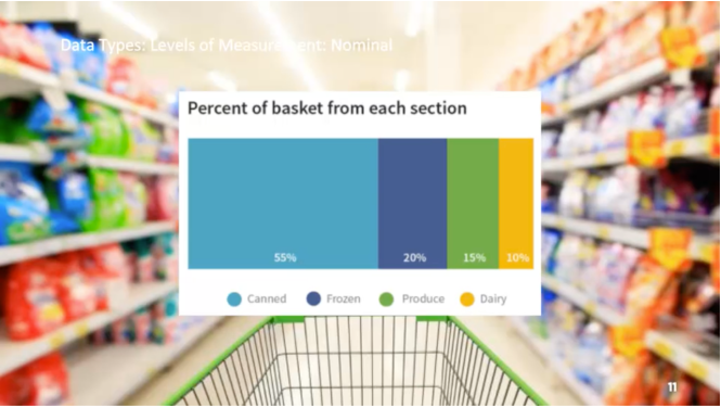
This data consist of name to categories to which the data falls. Nominal is unordered or a category.
Cant be used to take the average of the normal data but can be used to count percents.
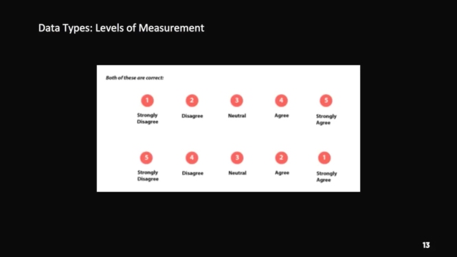
Have a natural ordering to the categories an example of an ordinal data is survey questions. Numbers are assigned to the category to make the data entry or analysis easy.
Can count ordinal data and use to calculate percentage but there is some disagreement if you can average ordinal data.
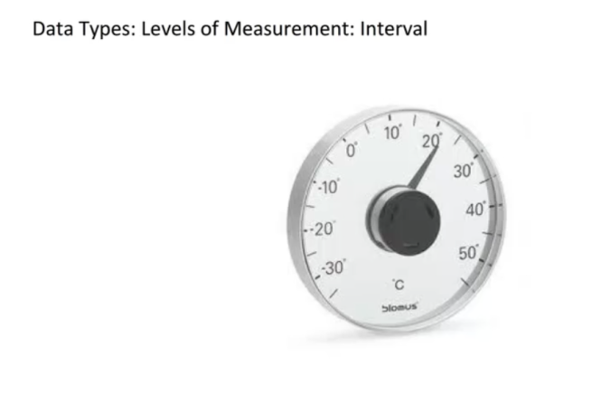
Interval data is numeric and can be used with mathematical operations but doesn’t have a meaningful 0 point. Example a temperature of 0 if measured in Celsius or farenheit doesn’t mean that there is no heat.
Other Interval data that we encounter in our everyday lives are calendar, years and temperature.
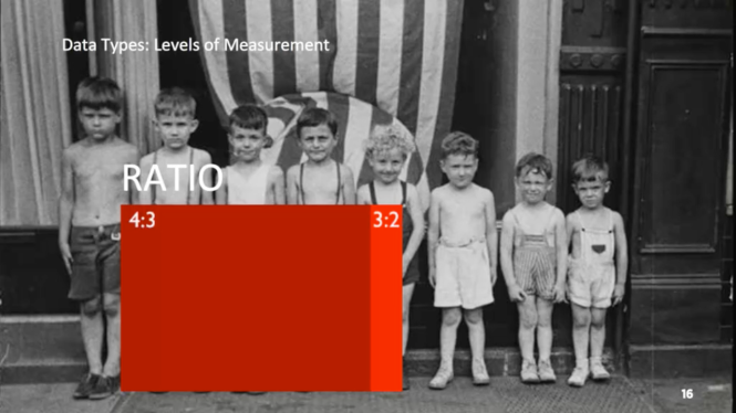
Ratio data is like an interval data but it does have a meaningful 0 point. In ratio data the value of 0 indicates an absence of what ever you are measuring so 0 means that you do not anything of that type.
Examples are age, height, money and weight
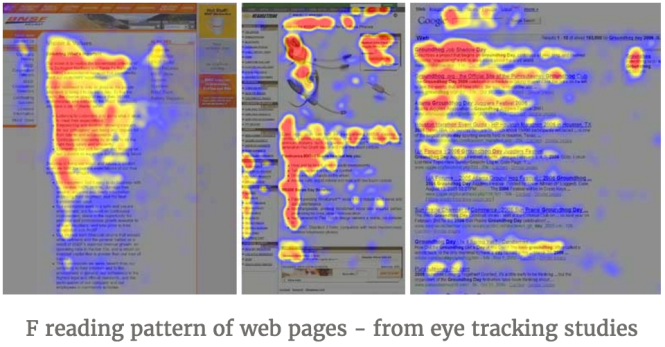
The web and the associated information has shown that the majority of visitors will not stay in your website for more than 10 seconds. Studies show that visitors who stay in your website more than 10 seconds skim through your page in an “F” pattern to look for something they care about instead of reading it.
So what can we do about this? The solution is what we call the 4×4 Model for Knowledge content, which consists of four key and critical components for those models. By using this format, your audience will be more engaged and will be able to give the right information to the right people.
 Models:
The water cooler – The content is brief, direct and exciting. The main purpose is to engage the user and grab the attention of the users by making them curious to find out more. This information should be found THROUGHOUT a website not only just the headline and ads.
The Café – The progress from the Water Cooler content that explains the ideas rather than just introducing them. Café content is the most difficult to pull off as it needs to be constructed to tell an exciting story. This means that café must be a story that visitors can relate to.
Research Library – The self-selected topic of a reader. This section contains a more scholarly research and data that backs up what was emphasised in the Water Cooler and Café. It is important that the Water Cooler moments should not disappear in this section and should include images and key points called callouts. Another critical piece of the Library content is the Café where every piece of the Library content you publish should have an executive summary or café content.
The Lab – This section is where users can interact with the data found in the Research Library. This component is the uncommon but the most powerful in many ways. The Lab allows users to open the vaults and give users the data. They can play with the content and make it about them and their interests.
There are also four critical components in addition to the four models of content that should be used throughout the models. This will lead to better outcomes for the increase of understanding and engagement of the users.
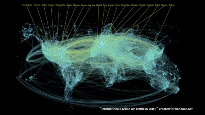
Visualisation – Visualisation is not just about the data but also the concept and geographic visualisation. An example of this is comparing a bar chart to a table in Excel. The bar graph is not only more appealing for the users but it also made it easier for them to understand the information within 10 seconds.
Story-telling – Is the concept of turning something abstract into something users can relate to. One of the most effective ways to do Story-telling and visualisation is through video.
Interactivity – This component allows the users to be the masters of their own destiny. It gives them the freedom to explore online content. This is a critical component whenever you are delivering content but does NOT mean over-using hyperlinks.
Shareability – This is where the power of Water Cooler comes into play. Those are the pieces that most likely to be shared by your audience. This feature will allow more traffic leading back to your site content.
Articles:
The 4X4 Model for Winning Knowledge Content Online. (2011). Inspired Magazine. Retrieved 20 July 2016, from http://inspiredm.com/winning-knowledge-content/
Data visualisation is a medium that speaks to people, as designers we need to take into account on how to visualise a data in order for it to communicate and tell a story.
If we compare the date consumed in 2002 and today. The amount of data consumed was 23 exabytes which is equivalent to 23 billion gigabytes was recorded in the year 2002 compared to the data we use today which consume that data in around seven days
Data visualisation is the representation of data with the use of graphs and images. Data on its own is hard to understand and would need to be interpreted and designed by designers so others will be able to relate and understand the data easily.
